In the interest of constant improvement, we feel it's time to revamp our logo. We love our current logo because it's not the "typical" barbell/KB logo of most gyms, but realize it requires a lot of explanation and doesn't do us many favors from an initial "visual capture" perspective.
In a nutshell, we love the deep respect and values that are intrinsic to the Polynesian heritage, and thought using this style for the logo would help explain our own core values as we built the business. After 3 years, we’ve learned that no one really gets it; no one really cares; it’s way too busy; and doesn’t infer fitness in any way. Here's the official explanation: http://www.crossfithermitage.com/daily-blog/first-post
Our current community is about 60% female, 30-50 years old who (mainly) are just touching a barbell for the first time. We DO want to attract more guys, but simply to create more balance...not to create the "elite fitness fire breather" environment. We have a few people who used to be college athletes and have that 'go' switch - they love the competition, but we work purposefully to keep it healthy and avoid egos. Although we love the 'badass' type logos and think that might draw more men and/or competitive people, we want to avoid the hard rock, skull and crossbones look. We want to respect our current athletes just as much as we want to speak to our potential athletes.
A few additional thoughts:
After doing TONS (and I mean TONS) of research, sitting on ideas, talking through them, and even working with a previous design team that did NOT hit the mark for us....here's what we've narrowed everything down to.
Without question, I WANT CLEVER! I'm not willing to compromise on this; I want to work with a designer who has ideas that I don't have...who will bring more to the table that I do...and who will tell me when I have a bad idea...all in the interest of creating something we're BOTH proud of. When I look at the updated logo, I want to smile and say "now THAT's a cool logo!"
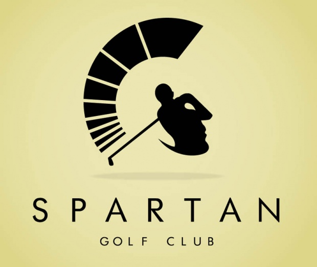
I'm drawn to visual double entendres and the clever use of typography, and I want the logo to somehow use negative space like the first five examples below. In the end, I'm looking for more than a pretty image; the revamped logo needs to be intelligent, clever, and send a clear message that we’re about quality and details.
In a nutshell, we love the deep respect and values that are intrinsic to the Polynesian heritage, and thought using this style for the logo would help explain our own core values as we built the business. After 3 years, we’ve learned that no one really gets it; no one really cares; it’s way too busy; and doesn’t infer fitness in any way. Here's the official explanation: http://www.crossfithermitage.com/daily-blog/first-post
Our current community is about 60% female, 30-50 years old who (mainly) are just touching a barbell for the first time. We DO want to attract more guys, but simply to create more balance...not to create the "elite fitness fire breather" environment. We have a few people who used to be college athletes and have that 'go' switch - they love the competition, but we work purposefully to keep it healthy and avoid egos. Although we love the 'badass' type logos and think that might draw more men and/or competitive people, we want to avoid the hard rock, skull and crossbones look. We want to respect our current athletes just as much as we want to speak to our potential athletes.
A few additional thoughts:
- We'd like to include "Established 2011" somewhere in the new logo.
- Hermitage is the name of our city, and we're just on the outskirts of Nashville, TN. There's no real reason to focus on the "H" or the word Hermitage.
- We'd like to keep the current green/orange color palette, but it can be adjusted a little if needed.
- I don't like the typical gym logos of silhouettes lifting barbells, or the kettle bell replacing the "O" in CrossFit, or rings hanging from the letters.
After doing TONS (and I mean TONS) of research, sitting on ideas, talking through them, and even working with a previous design team that did NOT hit the mark for us....here's what we've narrowed everything down to.
Without question, I WANT CLEVER! I'm not willing to compromise on this; I want to work with a designer who has ideas that I don't have...who will bring more to the table that I do...and who will tell me when I have a bad idea...all in the interest of creating something we're BOTH proud of. When I look at the updated logo, I want to smile and say "now THAT's a cool logo!"
I'm drawn to visual double entendres and the clever use of typography, and I want the logo to somehow use negative space like the first five examples below. In the end, I'm looking for more than a pretty image; the revamped logo needs to be intelligent, clever, and send a clear message that we’re about quality and details.
|
|
|
|
|
Random other "logo likes"
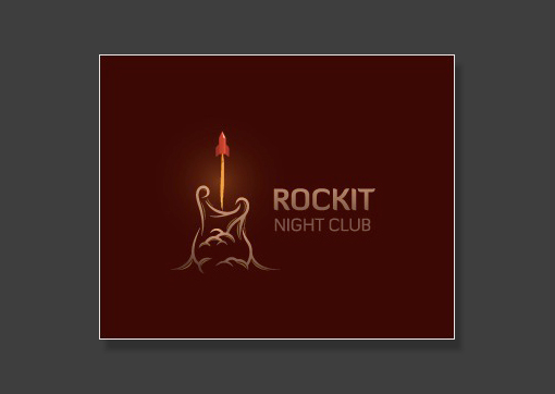
Like the font here, the fact that it's boldly outlined, and the fact that one word kind of sits on top of the other. Love that the "object" is part of the logo, but could clearly stand on its own maybe on a t-shirt front pocket with the words in another place on the shirt.
|
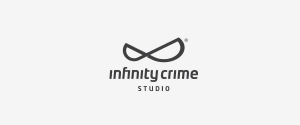
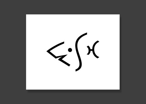
I like the 'tweak' of the infinity symbol to make it look like a crime-fighting mask. Really clever!
|
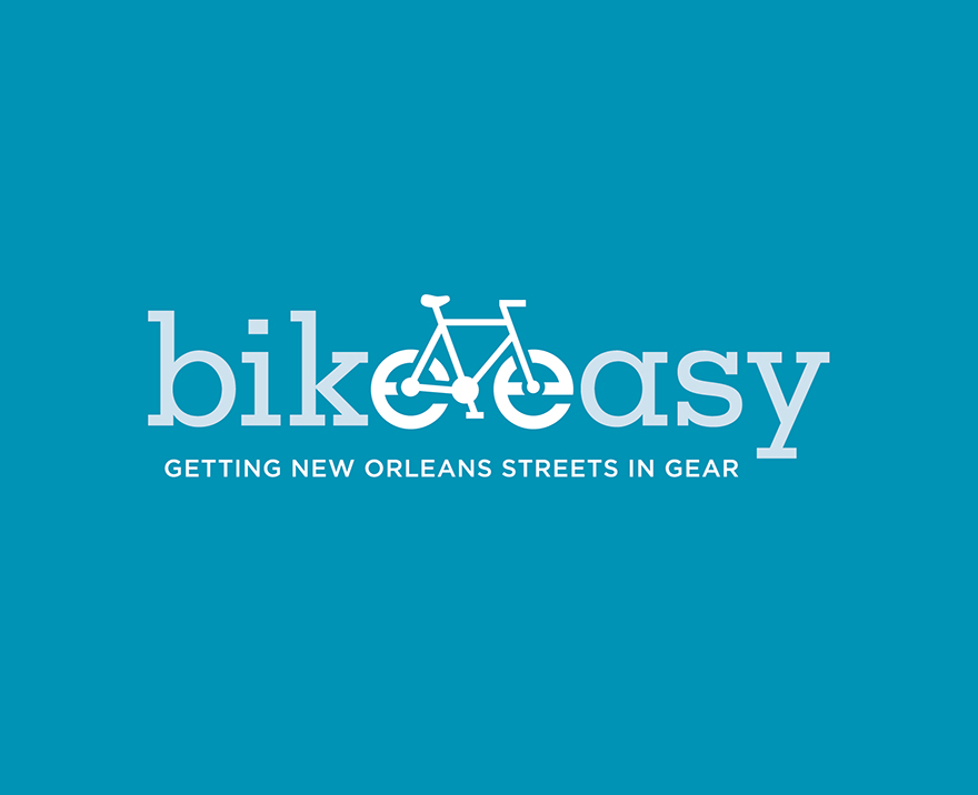
Like the way both Es are used as tires.
|
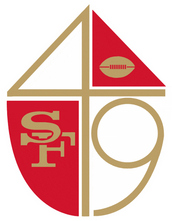
Like the concept of the shield WITH the clever way they put 49 in the mix.
|
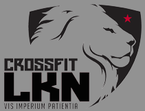
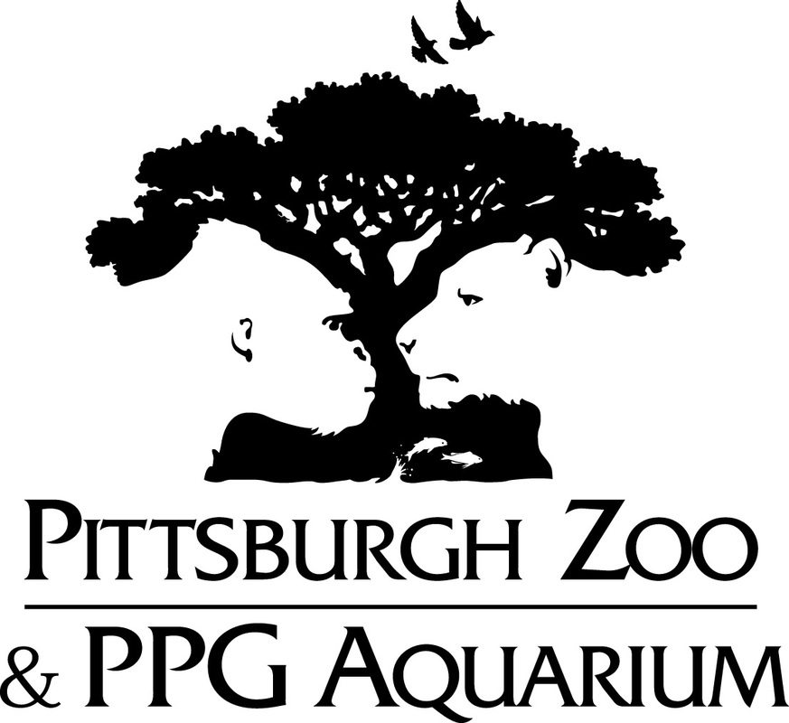
Simple, but effective. Love the fact that a shield exists, but doesn't encompass the lion and the text.
|


Like the use of multiple objects pulled together to create one image.
|

Love the double-purpose of the 2 as the N and the meaning.
|
|